UX Design: “Gather Cafe”,
Student Work
Role: concept, research, low and high-fidelity prototyping, usability studies, iterating designs
Client: Student work for an idealized cafe, “Gather”
Overview: Gather is a midwest cafe seeking to streamline ordering food/bev from restaurant tables with the assistance of QR codes. Customers can order to-go, or from their assigned table with a web-based application. I opted for a goal-directed design approach that helped the timeline of four months to move along smoothly. Qualitative research methods proved to be the most effective during my design process, most notably my user interviews and usability testing sessions.

STORY BOARD
Challenges
Design a cohesive interface for familiar and unfamiliar users
Create a minimalistic UI while keeping products as the focus
Provide a seamless & linear ordering experience

User Research: Summary
I conducted interviews and created empathy maps to understand the users I’m designing for and their needs. A primary user group identified through research was 18-50 year-olds who eat out regularly.

PERSONA A

PERSONA B
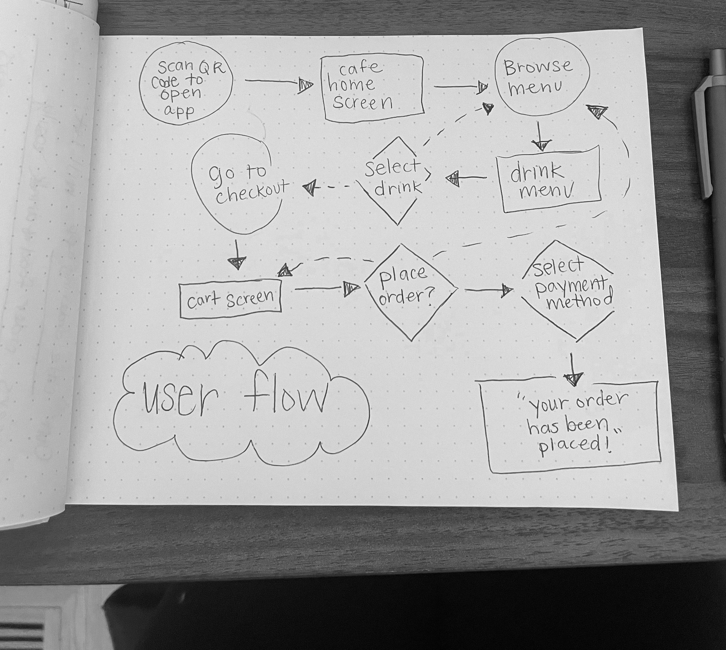
Preparing the Journey
I constructed a use flow of what a basic start to finish journey looks like while placing an order. This helps the designer understand ways users can interact with the items, as well as allow me to see navigation through user goals.

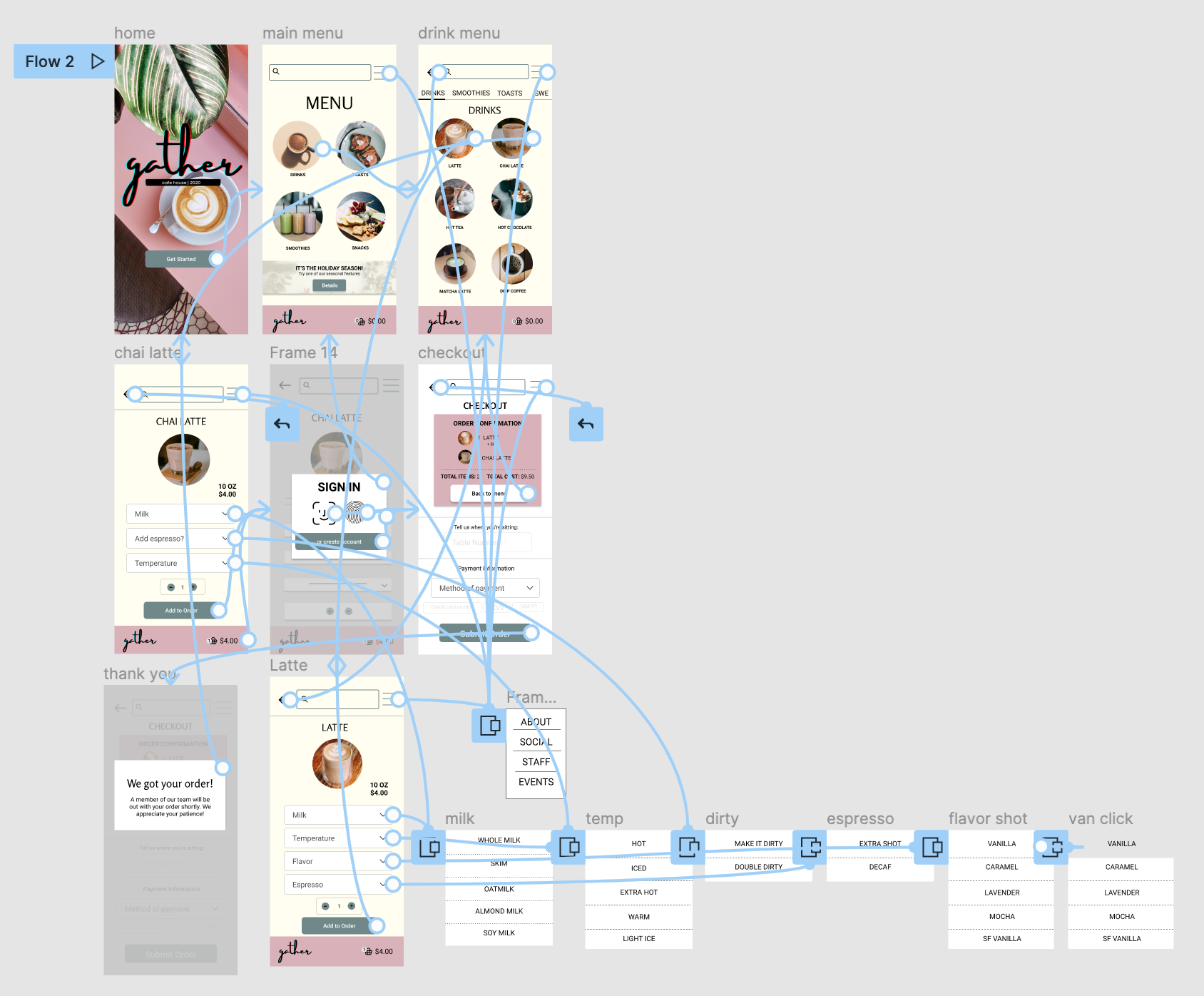
Wireflow
After sketching out some wireframes and thinking through the preliminary flow, I reviewed what was necessary, unnecessary, and what areas needed improvement.

USABILITY STUDY FINDINGS
-
Streamline login.
Forcing users to login at app entry proved to be too overwhelming. Presenting login after client is ready to place order proved to be more beneficiary.
-
Additional Confirmation.
Users wanted an extra section or page to confirm their order before entering payment. I found that simply adding a section at the top of the order confirmation screen was sufficient.
-
Wait time.
After placing an order, most users felt a need to know how long until their food arrived. By placing a real-time clock on their order complete screen, customers can see how long until their food is expected to be at their table.
Style Guide
Combining soft colors with the teal and blush of the Gather signature colors was the basis for this style guide. The guide was a vital key in creating typefaces, buttons, and dropdown for the application.